
I’ve shown you how to use the X1 theme with NetScaler Gateway and StoreFront before. It’s the unifying theme Citrix is using across the great majority of their products. In this guide I’m going to show you how to get the same X1 look and feel on your ShareFile split login page when you use single sign-on. I’ve talked about ShareFile and configuring single sign-on using a few different ways already:
- How to setup Citrix ShareFile single sign-on using SAML IDP on NetScaler
- How to setup Citrix ShareFile with AD FS 3.0 for Integrated Windows Authentication
No matter the SSO method you choose, setting up the X1 theme on the ShareFile logon page will gives your Citrix Workspace a more polished and uniform look when it matches your NetScaler Gateway, StoreFront, Receiver, Worx Home, etc. Users will appreciate a familiar Citrix Workspace experience.
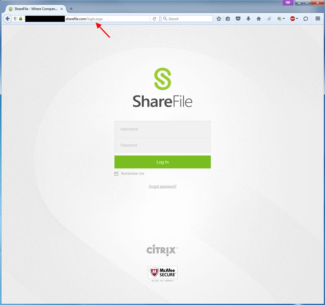
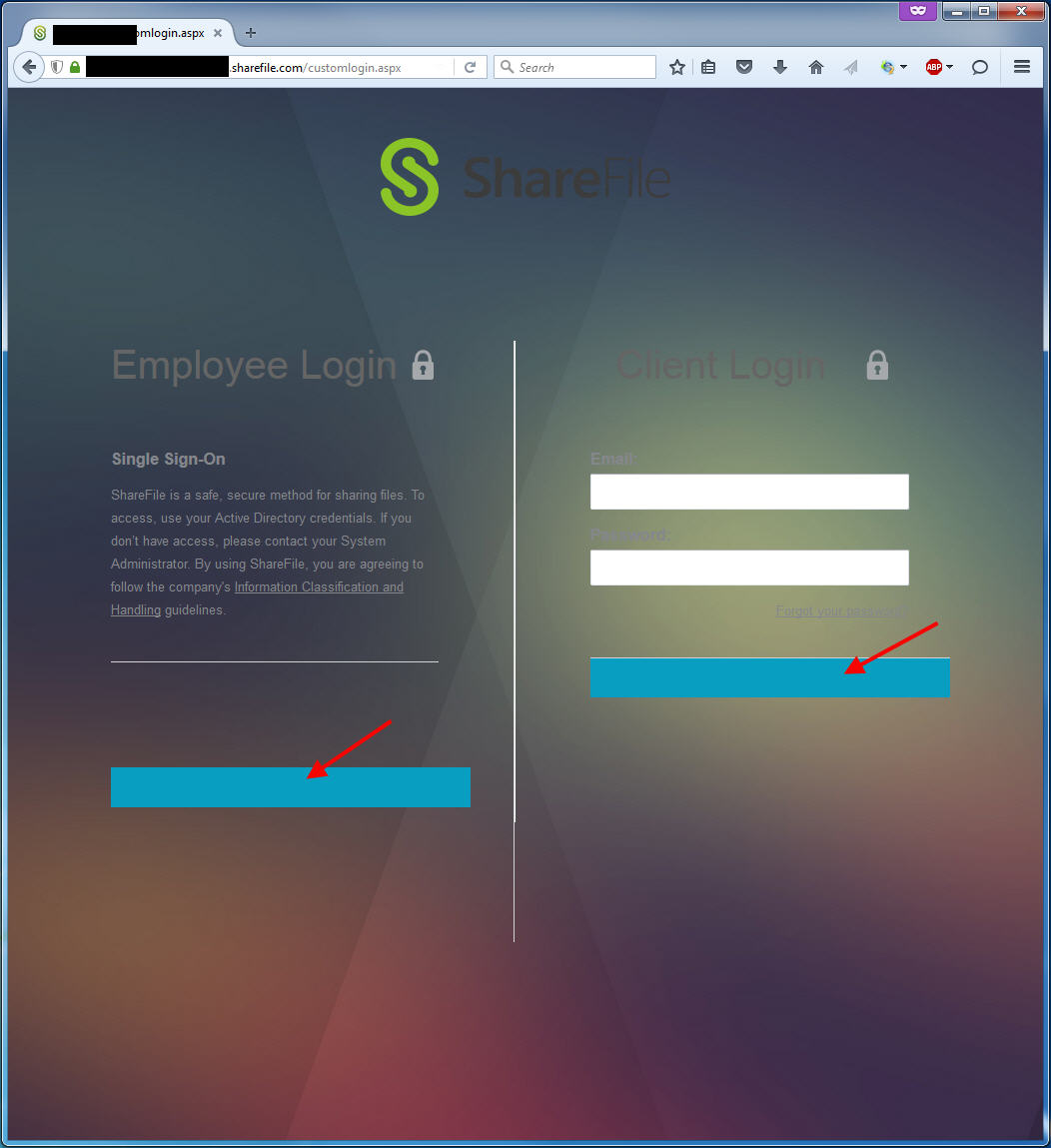
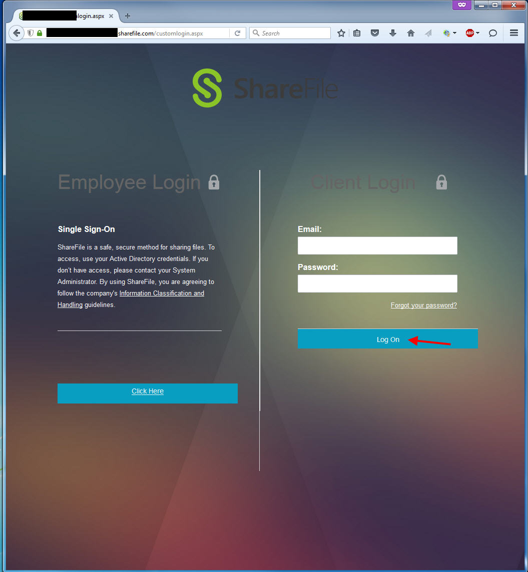
Here’s how the default login page login page looks for ShareFile, it lands you on the login.aspx page:
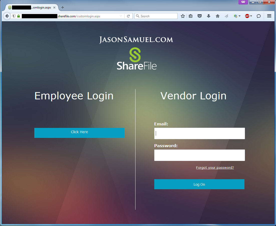
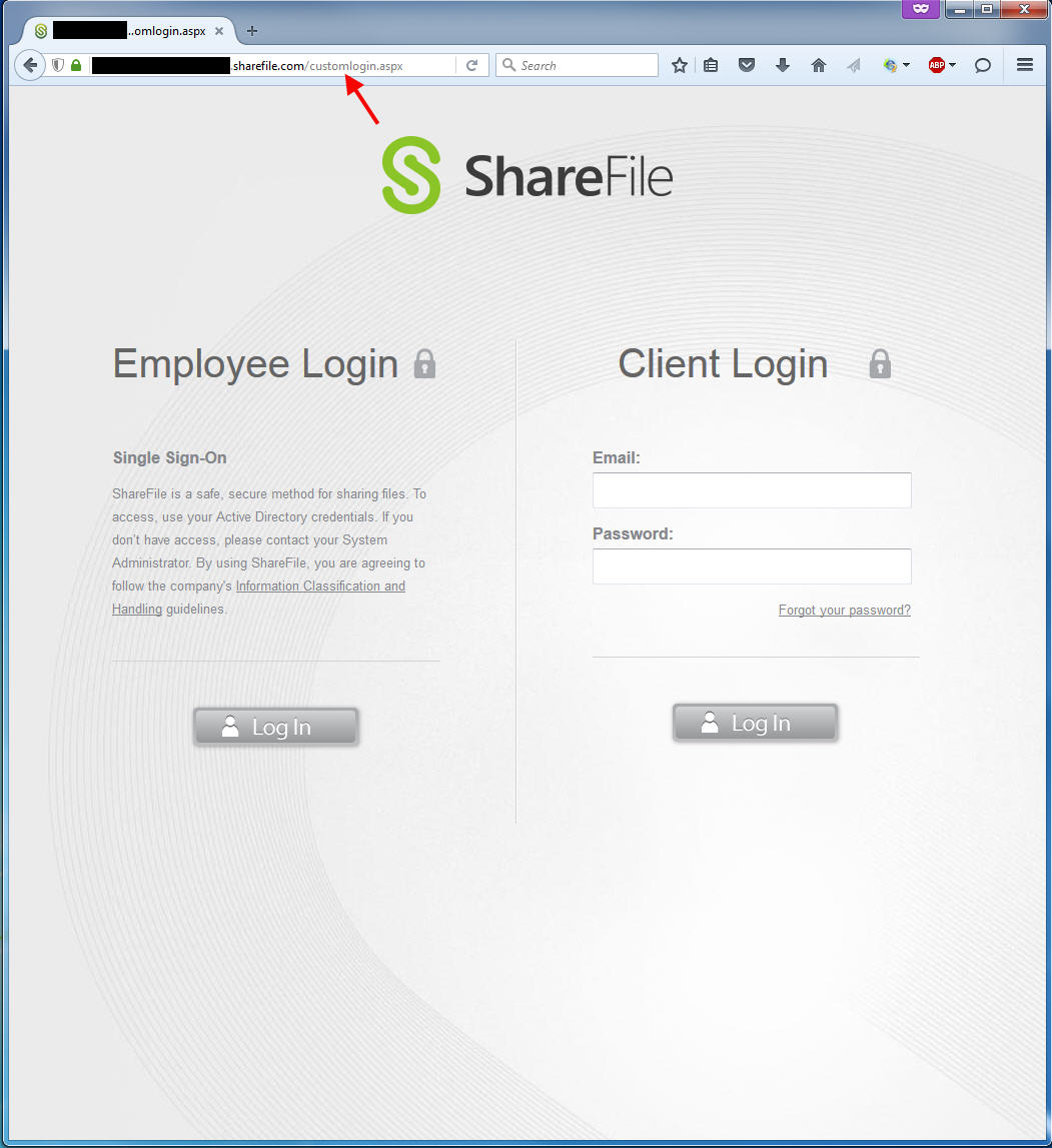
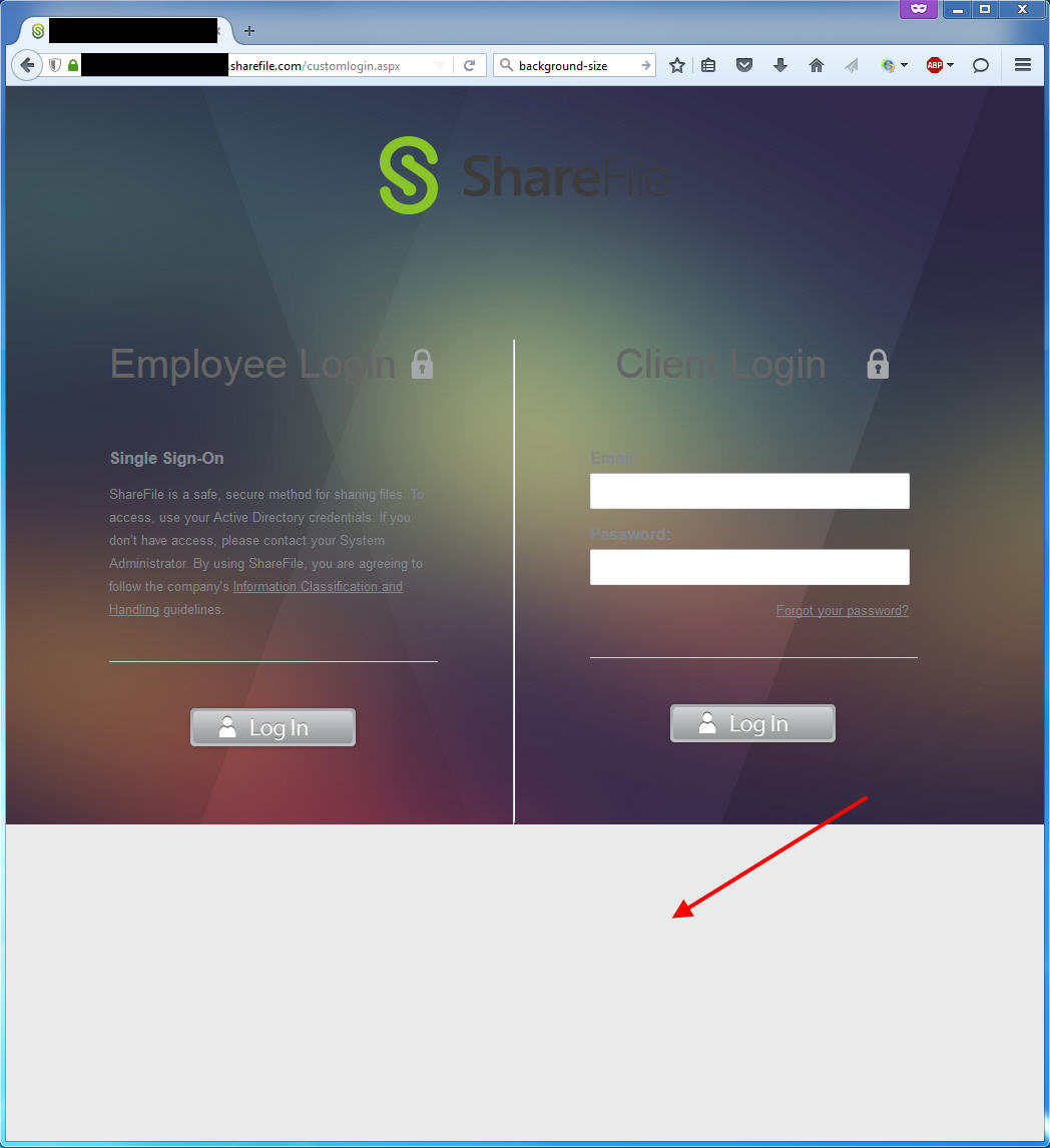
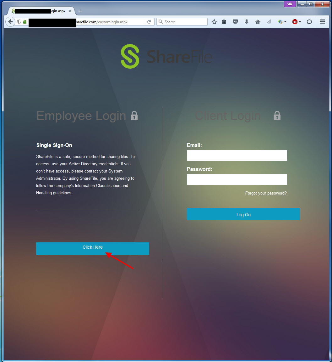
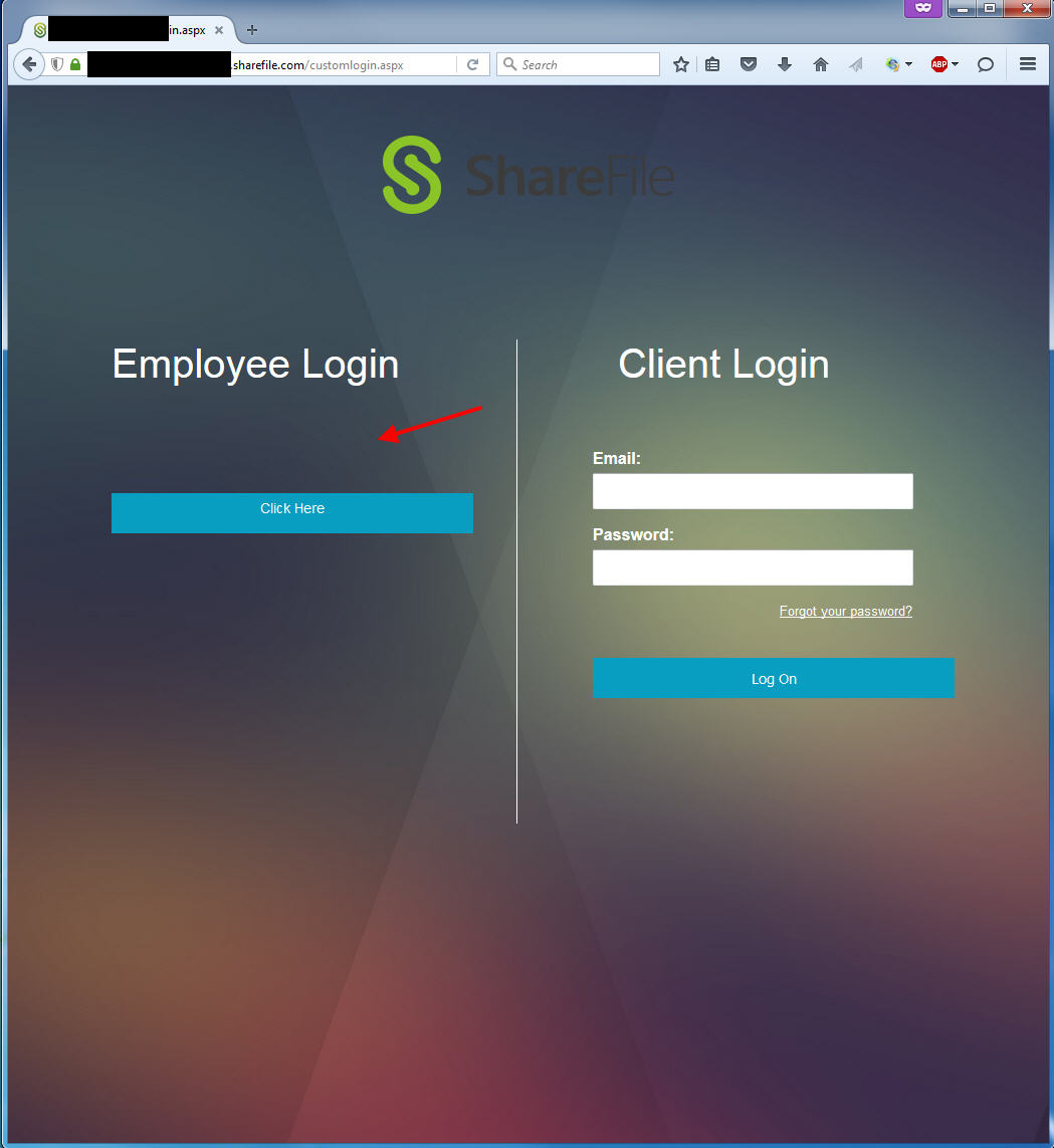
And if you want to use single sign-on wih SAML, ADFS, etc. for company users as well as allow the use of cloud based accounts for external clients/vendors, then you have to call Citrix Support and speak with the ShareFile Support team to get your account switched over to the split login page which looks like this and will land you on the customlogin.aspx page:
You will need to download a copy of the HTML behind this page from the below link to modify:
http://support.citrixonline.com/en_US/ShareFile/help_files/SF090016?Title=Custom+Login+Screen
Once you unzip it you can upload the Customizations folders in this zip file and immediately your customlogin.aspx split login page will reflect the changes you made.
The problem is that ShareFile does not currently offer an X1 theme so you have to make your own. Citrix has been slowly rolling X1 out to all their products over the past year and it has required a tremendous change to the software architecture of several of these products. Wonderful positive change because the Workspace has never felt more uniform. Since ShareFile is a different beast all together with a “shared” control plane in the AWS cloud for all customers, the X1 theme hasn’t quite made it over yet. Also remember with all sorts of ShareFile clients available, you have to figure out how to make each one suck in your branding like Receiver does with StoreFront for example. I’m sure it will eventually, but for the time being it’s up to you to create a unified Citrix X1 Workspace experience for your end users.
ShareFile endeavors to keep the login page pretty neutral by default to where the average user can upload their company’s logo, whatever colors it may be, and it looks okay. Basic color coordination, almost everything is going to look good against grey or white. You also have to remember not every ShareFile customer is a Citrix Workspace customer using NetScaler, StoreFront, Receiver, etc. so they’ve never even heard of X1 before and that technicolor look as default may put off a lot of them.
In the exercise I’m going to walk you through below, we’re going to take the default split login page code from the link I posted above and modify it as close as possible to the X1 theme. I’m far from ever being called a web developer but I can show you how to get it looking pretty close.
First let’s take a look at the what’s included in “Custom Login Template.zip”. You’ll see the following image files when you unzip the file in a “Customizations” folder, 2 jpeg files and 6 png files:
bg.jpg
bg.png
bg_s-rake_large.jpg
lock.png
login.png
logo.png
logonew.png
testlogo.png
You’ll also see the page containing the HTML code:
login.htm
You can open up login.htm in Notepad but I actually advise you to open up this original login.htm in Beyond Compare on the right side. Then make a copy of login.htm you intend to make changes to and open it up on the left side. So you are comparing login.htm vs. login.htm and everything is white meaning an exact match. Now as you modify and save the left side login.htm as you go through all my steps below you can easily see what you are changing in red which if you have never used Beyond Compare before means something is different between the 2 login.htm pages. You’re going to have a much easier time following my steps this way vs. hurting your eyes looking at Notepad hunting for each line.
The first thing to change is the two URLs to your subdomain per the Citrix Support link from above. Once done, let’s start with the X1 customizations. Disclaimer, you should do this after hours. I could make it easy on you and just host my customized login.htm page here on my website for you to download and use, but you won’t learn anything. I want to show you step by step and make sure you understand what each line of code does. Once you have a good understanding of the code, you can even take it further than I have and customize to your heart’s content. So I suggest making these changes after hours so you can follow me step by step. Alternatively if you are a ShareFile Enterprise customer call your ShareFile sales team and request they setup a small dev environment for you with a few of your licenses. It’s always good to be able to test changes in a dev environment before making them in a live production environment. Alright enough disclaimer, let’s get started:
1. Change the background, you can grab the background from your NetScaler Gateway (or StoreFront). The 2 images are slightly different so it’s your call. The NetScaler URL for the X1 image on a 11.x appliance with an X1 or X1 based theme will be:
https://gw.yourdomain.com/vpn/media/X1-bg-img.jpg
and on StoreFront you can pull it from the inetpub folder after you create your Receiver for Web Store. If you use the name “Store” it will be located in:
C:\inetpub\wwwroot\Citrix\StoreWeb\media\bg_x1.jpg
They are both 2560×1600 images and there’s not much difference to the naked eye. But the StoreFront version has 1 dpi resolution and is 49.6 KB in size while the NetScaler version is 96 dpi and includes a bit of meta data so is 151 KB in size. In my eyes it looks a little smoother. Again, your call what to go with. Save the .jpg to the same Customizations folders as everything else is in. Then change this line to from:
|
1 |
body { background-image: url({{bg_s-rake_large.jpg}}); background-repeat: no-repeat; background-color: #EBEBEB} |
to
|
1 |
body { background-image: url({{X1-bg-img.jpg}}); background-size: cover; background-repeat: no-repeat; background-attachment: fixed; background-color: #464646} |
To break this down:
- background-image = changing the image to the X1 background
- background-size = cover the image responds to the size of your browser window
- background-attachment = fixed to fix the white space issue when resizing the window
- background-color = sets the background color underneath the image. For a split second as the page loads the user will see this color. You want to transition the user’s eyes to X1 easily so I picked this dark grey color which matches the theme. Your NetScaler X1 theme is set to #000 which is jet black. I feel like this is a little too harsh on the eyes so that’s why I went with #464646
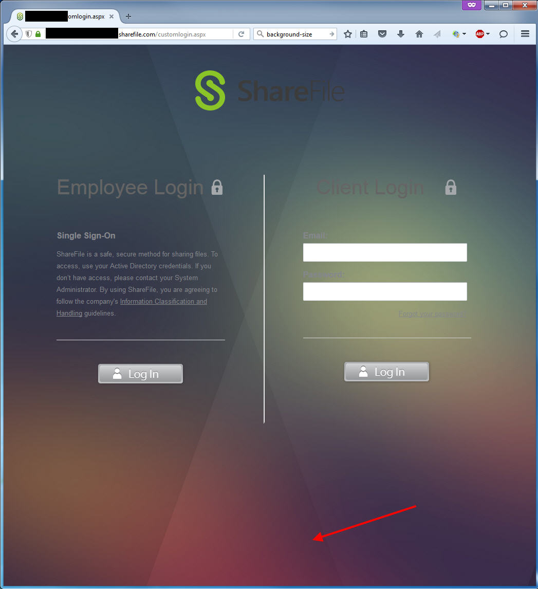
If you just upload the image and change that part of the code without anything else, the image looks pretty bad. It will be stretched out like this to the full 2560×1600 regardless of your monitor or web browser window. You want the background image to be responsive. You want it to resize on the fly depend on the size of the monitor or as you drag the corner and resize the browser window. This looks pretty bad:

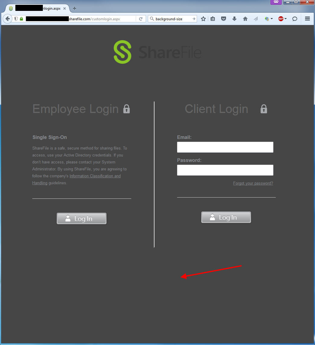
so you set the image background size to “cover”. But once you set that all of a sudden you have this white space below if you make the size of your browser small:
so to eliminate the white space we have to set the background attachment to “fixed” which ties the image to the viewport. You should end up like this now:
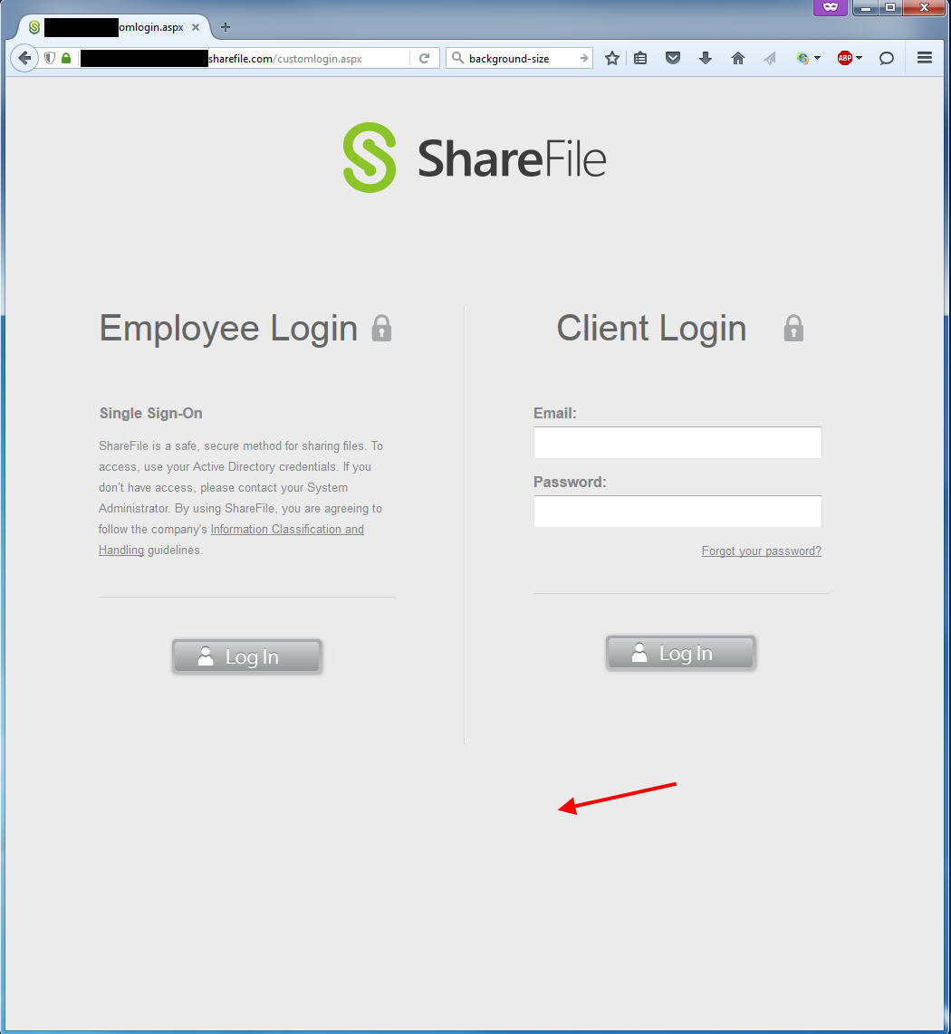
Now lastly change the background color. By default this is the color the user sees for a split second:
once you get it changed to the dark grey, it’s going to look like this for a split second which in my opinion is a lot nicer transition:
Once you upload login.htm and your background image to the Customizations folder in the ShareFile control plane, hit refresh and you should end up with something like this at this point:

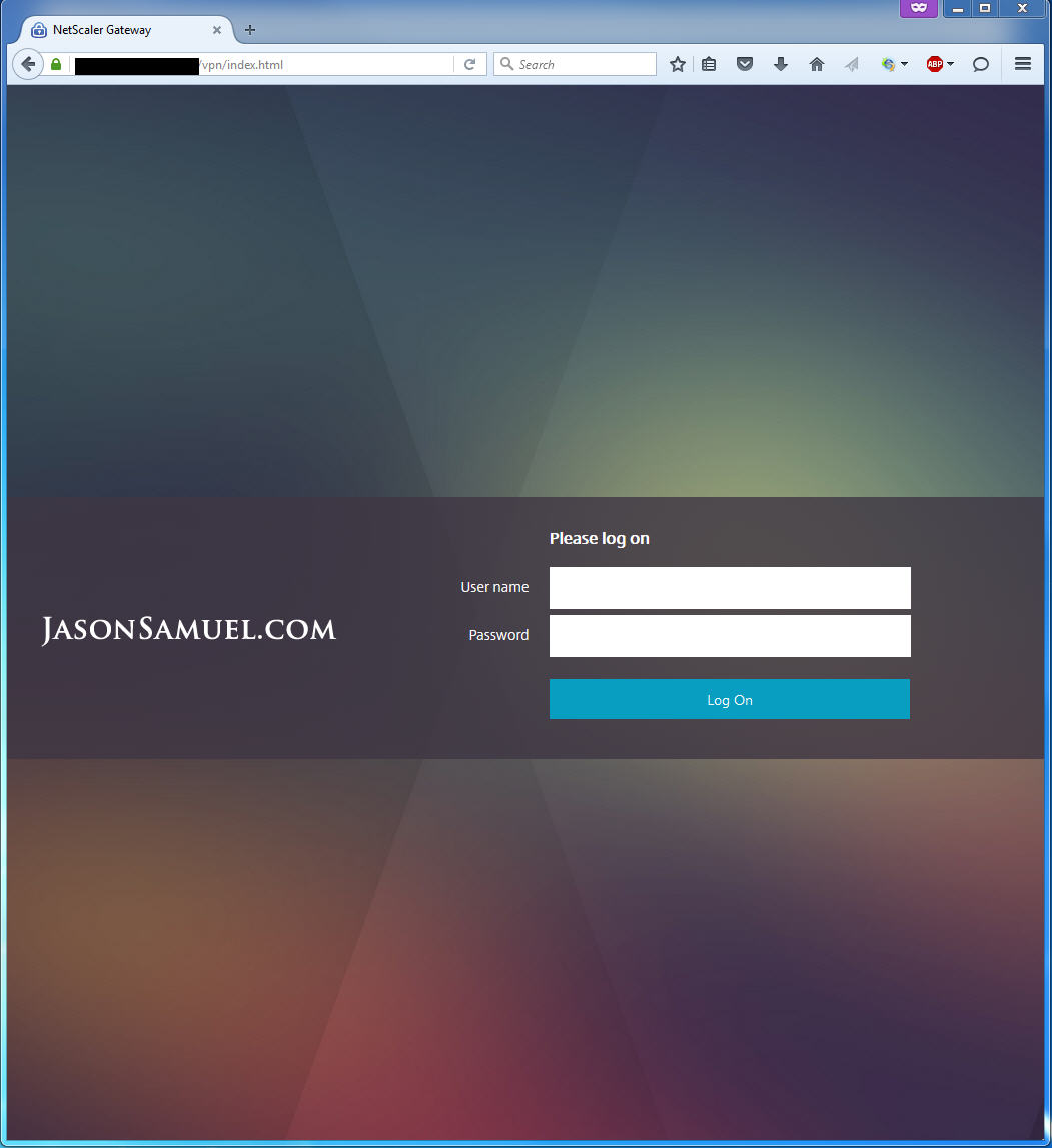
It’s pretty close to what an X1 theme looks like right? Here, you can compare to my NetScaler Gateway login page:
2. Ok, so if you compare where you’re at with my NetScaler Gateway login page, the thing that stands out is the login boxes. You want that nice blue square look. Not those ugly “Log In” buttons. So let’s change them. Change these 2 lines:
|
1 2 |
.login { background:url({{login.png}}); height: 52px; width: 179px; margin: 40px auto; cursor: pointer; } #btnLogin { background:url({{login.png}}); height: 109px; width: 327px; margin: 39px 0px 0px 0px; cursor: pointer; border-top: 1px solid #D1D3D4; border-right: none; border-left: none; border-bottom: none; background-position: center 40px; background-repeat: no-repeat; } |
to:
|
1 2 |
.login { background:#02a1c1; height: 40px; width: 360px; margin: 105px auto; cursor: pointer; } #btnLogin { background:#02a1c1; height: 40px; width: 360px; margin: 39px 0px 0px 0px; cursor: pointer; border-top: 1px solid #D1D3D4; border-right: none; border-left: none; border-bottom: none; background-position: center 40px; background-repeat: no-repeat; } |
What this did is get rid of using those login.png files completely, change the background to that nice #02a1c1 blue color, adjust the height and width of the boxes to 40 pixels by 360 pixels to match the NetScaler which gets you to this point. Note I also bumped the margin from 40 px to 150 px and this is because we want to push the blue button on the left down further, I’ll get to more on this later:
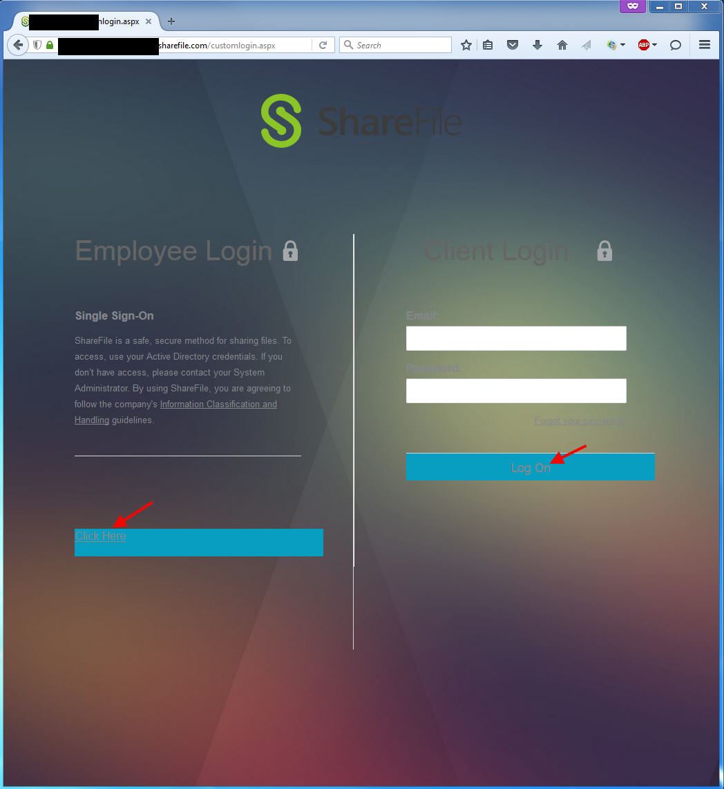
3. Now you need to add some text since you aren’t using images anymore. You want to modify these 2 lines to get both the left and right sides of the split login page:
|
1 |
<a href="https://yoursubdomain.sharefile.com/saml/login" target="_top"><div class="login"></div></a> |
|
1 |
<input type="submit" id="btnLogin" class="go png" value="" /> |
to:
|
1 |
<a href="https://yoursubdomain.sharefile.com/saml/login" target="_top"><div class="login">Click Here</div></a> |
|
1 |
<input type="submit" id="btnLogin" class="go png" value="Log On" /> |
Make sure your login URL is correct again, don’t copy and paste my example URL by accident. You should end up with something like this:
4. So obviously you will make people’s eyes bleed if you leave that default grey font color. Let’s change the color to white, center it, and the set the font to 14 pixels to match your NetScaler. Change this line you were working on before:
|
1 |
.login { background: #02a1c1; height: 40px; width: 360px; margin: 105px auto; cursor: pointer; } |
to:
|
1 |
.login { background: #02a1c1; height: 40px; width: 360px; margin: 105px auto; cursor: pointer; font-size: 14px; text-align: center; line-height: 30px; } |
and let’s change the font color to white by changing these 2 lines to get both the left and the right sides:
|
1 |
vertical-align: baseline; font-family: Arial; color: #85878C; |
|
1 |
#btnLogin { background: #02a1c1; height: 40px; width: 360px; margin: 39px 0px 0px 0px; cursor: pointer; border-top: 1px solid #D1D3D4; border-right: none; border-left: none; border-bottom: none; background-position: center 40px; background-repeat: no-repeat; } |
to:
|
1 |
vertical-align: baseline; font-family: Arial; color: #FFFFFF; |
|
1 |
#btnLogin { background: #02a1c1; height: 40px; width: 360px; margin: 39px 0px 0px 0px; cursor: pointer; border-top: 1px solid #D1D3D4; border-right: none; border-left: none; border-bottom: none; background-position: center 40px; background-repeat: no-repeat; color: #FFFFFF; } |
You should end up with something like this where all the font body colors are now white, everything is centered:
5. You’ll notice Log On button font size on the right side is massive. So let’s fix that. Change:
|
1 |
.right input { height: 30px; width: 307px; margin: 5px 0px 15px 0px; font-size: 18px; color: #85878C; padding: 2px 5px; line-height: 30px;} |
to
|
1 |
.right input { height: 30px; width: 307px; margin: 5px 0px 15px 0px; font-size: 14px; color: #85878C; padding: 2px 5px; line-height: 30px;} |
and you should end up with something like this:
6. The other glaring problem is that Click Here is underlined. Change this line:
|
1 |
vertical-align: baseline; font-family: Arial; color: #FFFFFF; |
to:
|
1 |
vertical-align: baseline; font-family: Arial; color: #FFFFFF; text-decoration: none; |
and goodbye underline:
7. Ok now why is there a double line in the middle? Let’s get rid of that. Change:
|
1 |
.left { width: 328px; padding: 0px 75px 30px 75px; margin-top: 125px; border-right: 1px solid #D1D3D4; float: left; display: inline; } |
to:
|
1 |
.left { width: 328px; padding: 0px 75px 30px 75px; margin-top: 125px; border-right: 0px solid #D1D3D4; float: left; display: inline; } |
and now the middle line is fixed:

8. Can we get rid of those lines right above our new wonderful blue login buttons? The answer is yes! You have to do the left and the right so change these lines:
|
1 |
.left p { border-bottom: 1px solid #D1D3D4; padding-bottom: 40px; font-size: 13px; line-height: 23px; } |
|
1 |
#btnLogin { background: #02a1c1; height: 40px; width: 360px; margin: 39px 0px 0px 0px; cursor: pointer; border-top: 1px solid #D1D3D4; border-right: none; border-left: none; border-bottom: none; background-position: center 40px; background-repeat: no-repeat; color: #FFFFFF; } |
to:
|
1 |
.left p { border-bottom: 0px solid #D1D3D4; padding-bottom: 40px; font-size: 13px; line-height: 23px; } |
|
1 |
#btnLogin { background: #02a1c1; height: 40px; width: 360px; margin: 39px 0px 0px 0px; cursor: pointer; border-top: none; border-right: none; border-left: none; border-bottom: none; background-position: center 40px; background-repeat: no-repeat; color: #FFFFFF; } |
Bam! No more lines. I purposely set one to 0 and the other to none to show you can achieve the same result both ways:
9. Now let’s fix the headings. Employee Login and Client Login are both grey. Let’s also get rid of those ugly grey locks. Change:
|
1 |
h1 { font-size: 40px; color: #656565; background:url({{lock.png}}) no-repeat right; font-weight: normal; margin: 0px 5px 60px 0px; } |
to:
|
1 |
h1 { font-size: 40px; color: #FFFFFF; font-weight: normal; margin: 0px 5px 60px 0px; } |
Look’s pretty clean now, right?
10. Let’s talk about user behavior. Get rid of the text under Employee unless you really need it. Most people don’t read the text at all. They immediately start typing in their email and password in the right hand side meant for vendors/clients because its the only login box on the page and if every other website on the Internet has a logon box on the right side, why stop and read text? They don’t understand this is a split logon page and they have to make a choice. They’ll go for that right hand side login everytime. Which is the cloud account login which they don’t have. Then they complain they can’t login and you have to tell them to simply click on the Log On button under Employee and it will pass them through. That’s why instead of saying “Log On” on the left side, I left it as “Click Here” and it takes them to the SAML SSO page or if using integrated windows authentication and ADFS will just pass them right on through. In my experience this makes it easier on your employees. You can just comment it out if for whatever reason you ever need to put a notification message or something to all users in the future. Change these 2 lines:
|
1 2 |
<h4>Single Sign-On</h4> <p>ShareFile is a safe, secure method for sharing files. To access, use your Active Directory credentials. If you don’t have access, please contact your System Administrator. By using ShareFile, you are agreeing to follow the company's <a href="http://www.citrix.com/English/ps2/products/product.asp?contentID=2320956">Information Classification and Handling</a> guidelines.</p> |
to:
|
1 2 |
<!--<p><h4>Single Sign-On for Employees:</h4></p>--> <!--<p>Single Sign-On text if you need to display a message to the users.</p>--> |
Look how clean that looks. The user’s eyes goes from Employee Login to Click Here. That’s it. Keep it simple.
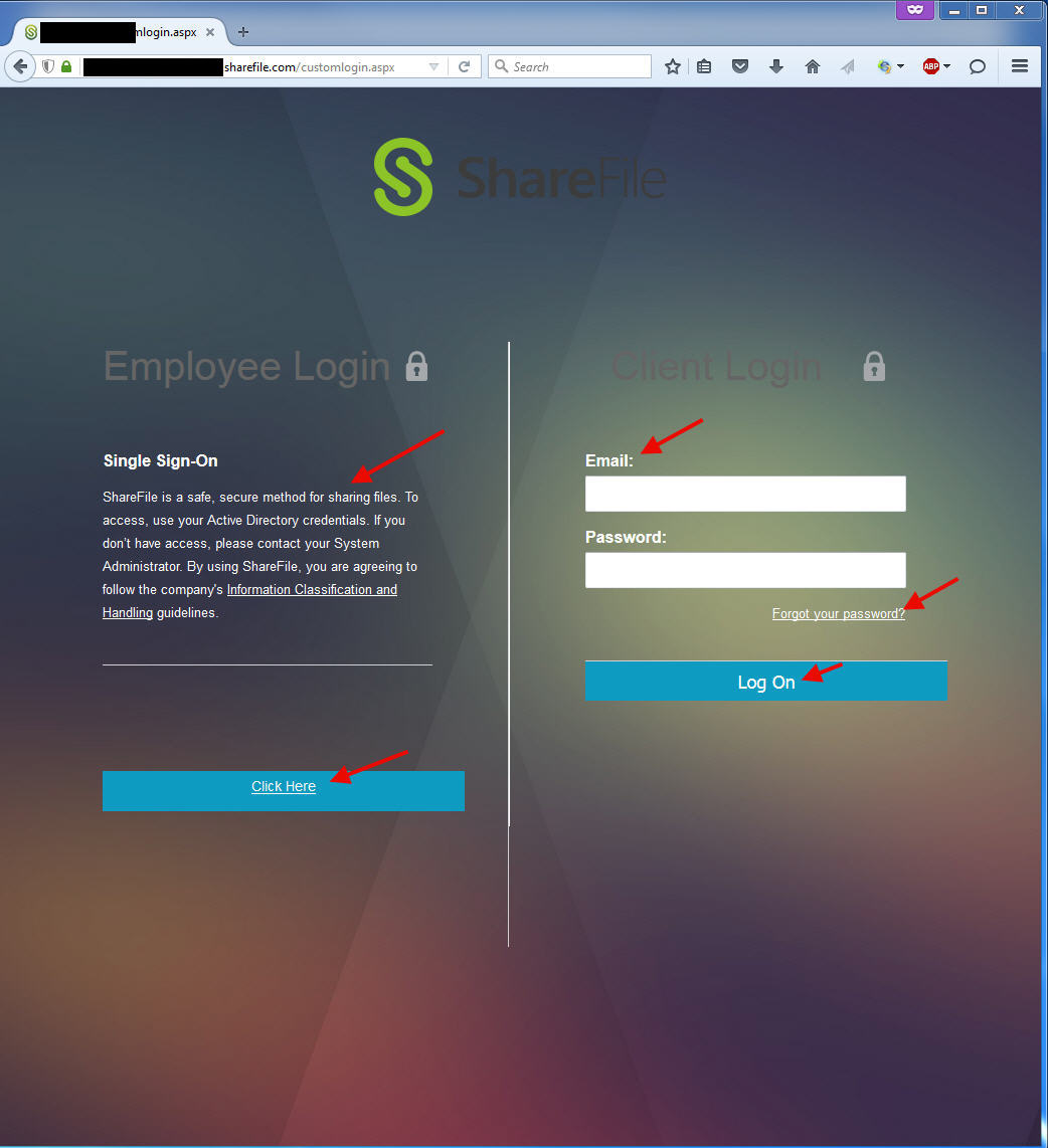
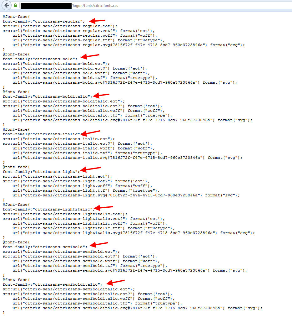
11. Now let’s talk about fonts. By default the font on this page is Arial. Your NetScaler Gateway uses a proprietary Citrix font family called “citrixsans”. You can use the same font on your NetScaler 11.x X1 theme gateway page. View the style sheet on your NetScaler by going to:
https://gw.yourdomain.com/logon/fonts/citrix-fonts.css
to see the paths to pull the fonts. There’s actually 8 different citrixsans fonts:
The other option is to keep it simple and use the tried and true Verdana font. This gives a nicer look and is a pretty decent approximation to citrixsans. Just change this line:
|
1 |
vertical-align: baseline; font-family: Arial; color: #FFFFFF; text-decoration: none; |
to
|
1 |
vertical-align: baseline; font-family: Verdana; color: #FFFFFF; text-decoration: none; |
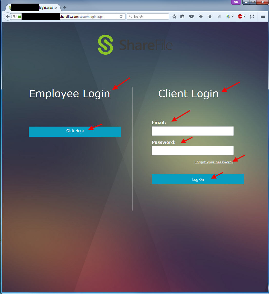
and look at the difference. Characters like the “y” in employee and the “t” in Client for example. Also note that the blue Click Here button on the left now lines up perfectly with the Email box on the right. Remember in step 2 where I had you set the margin to 105 px, this is why. It controls how the blue Click Here button lines up:
12. Change your logo. You can use the default ShareFile logo, your company logo, or even both together. The default ShareFile logo uses black letters so I broke out Photoshop and changed it to white. This looks better on the X1 background. I left the green ShareFile icon logo since it’s instantly recognized by users and it also adds a bit of pop to the page. Please try to keep your logo in .png format for the best results. Change this line:
|
1 |
.title { background: url({{testlogo.png}}) no-repeat; margin: auto; height: 78px; width: 290px; margin-top: 50px; padding-right: 0px; } |
to:
|
1 |
.title { background: url({{sharefile-jason-samuel-logo.png}}) no-repeat; margin: auto; height: 159px; width: 319px; margin-top: 50px; padding-right: 0px; } |
You will also want to modify the height and width to match your logo. In my case my logo went from 78 px height to 159 px. My width went from 290 px to 319 px. Make sure you upload the new .png logo when you upload login.htm. You should end up with something like this:
![]()
13. Notice how your logo is not centered with the line down the middle. This needs to be fixed so change the line you were just working on from:
|
1 |
.title { background: url({{sharefile-jason-samuel-logo.png}}) no-repeat; margin: auto; height: 159px; width: 319px; margin-top: 50px; padding-right: 0px; } |
to:
|
1 |
.title { background: url({{sharefile-jason-samuel-logo.png}}) no-repeat; margin: auto; height: 159px; width: 319px; margin-top: 50px; padding-right: 14px; } |
where the padding-right number is whatever you need to center the logo. In my case it was 14 px which is reflected above. You should end up with a nicely centered logo once done:
![]()
14. You’ll notice once getting your logo in you might have too much white space between the logo and the headers. You need to pull up the left side and the right side. Just change these lines:
|
1 |
.left { width: 328px; padding: 0px 75px 30px 75px; margin-top: 125px; border-right: 0px solid #D1D3D4; float: left; display: inline; } |
|
1 |
.right { height: 452px; width: 328px; padding: 0px 75px 30px 75px; margin-top: 125px; border-left: 1px solid #fff; float: left; display: inline; } |
to:
|
1 |
.left { width: 328px; padding: 0px 75px 30px 75px; margin-top: 62px; border-right: 0px solid #D1D3D4; float: left; display: inline; } |
|
1 |
.right { height: 452px; width: 328px; padding: 0px 75px 30px 75px; margin-top: 62px; border-left: 1px solid #fff; float: left; display: inline; } |
where the margin-top will vary depending on the size of your logo. 62 px is what looks the best for my logo. You should end up with something like:
![]()
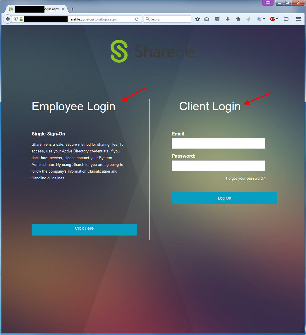
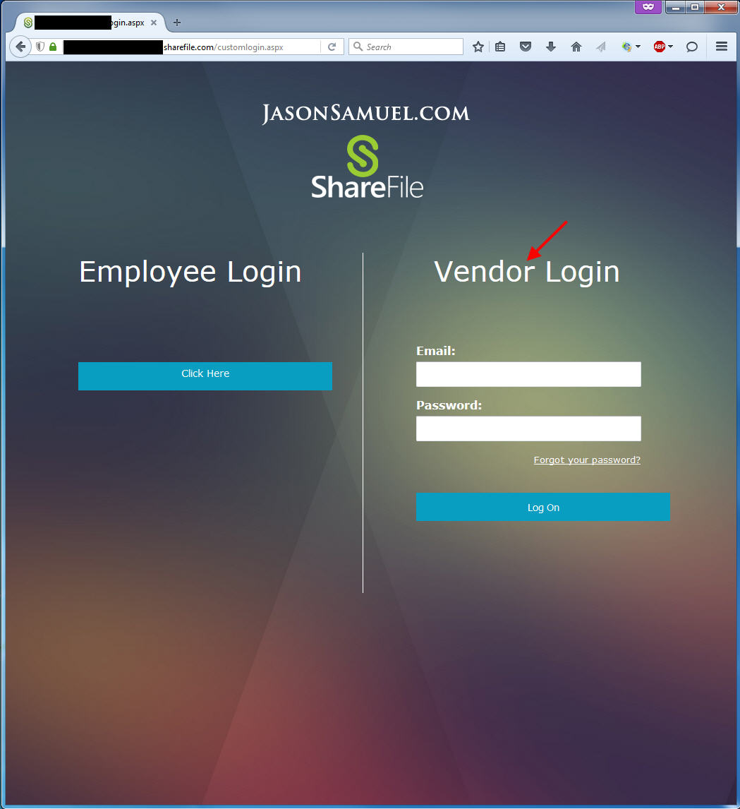
15. Lastly, I don’t like that the right side is called “Client Login”. It really depends on what business you are in and how you use ShareFile with external users. I prefer the word vendor so I’m going to change it to “Vendor Login”. Just change this line:
|
1 |
<h1 class="png">Client Login</h1> |
to:
|
1 |
<h1 class="png">Vendor Login</h1> |
and it should look like this:
16. Now try and type something into the box on the right side. Yuck. It’s a light grey font. Grey is the universal web color for inactive elements so this doesn’t look right:
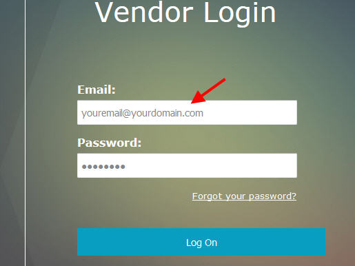
And it’s also not how your NetScaler looks. Let’s change that color and also bump the box dimensions to what the NetScaler Gateway logon page has. Change this line:
|
1 |
.right input { height: 30px; width: 307px; margin: 5px 0px 15px 0px; font-size: 14px; color: #85878C; padding: 2px 5px; line-height: 30px;} |
to
|
1 |
.right input { height: 40px; width: 350px; margin: 5px 0px 15px 0px; font-size: 14px; color: #333; padding: 2px 5px; line-height: 30px;} |
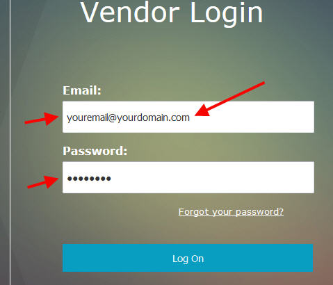
and you should end up with this:
17. Alright, we made it to the final step! Compare your ShareFile X1 logon page vs. your NetScaler Gateway X1 logon page:
vs.
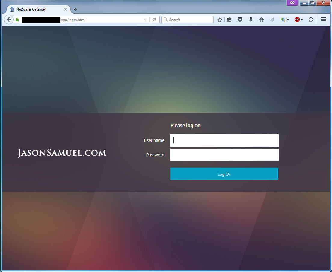
Pretty good! If you made it through these 17 steps and it looks like what I have good work! It may have been painful making all these changes line by line but now you have a really good understanding of the code and how everything works. I hope this guide has helped you out. If you have any comments or questions please post below. I’d love to hear if you have modified the code even more than this. Always great to hear how people are doing things and learn something new myself. 🙂